
On-chain analysis is a young branch of the field of data analysis dedicated to the study of blockchains. It observes and synthesizes the overall behavior of the participants in a network to extract health and investment signals.
Glossary of on-chain analysis
The time has finally come for you to discover the fabulous world of on-chain analysis . Motivated, you skim the documentation of multiple on-chain data providers, you browse Twitter in search of information and opinions on the subject.
It may be a small step for others, but a giant leap for you!
However, a barrier stands in front of you: You do not always understand the vocabulary , the terms and the elements used by some…
- “GN’s T3 data provides excellent insight into the behavior of LTHs. “
- “The neutral zone of the NUPL, as well as the threshold of 0.5 of the NRPL, we act as a support. “
- “The development of UTxO CQ metrics is progressing well. “
Do not panic ! Here is a glossary containing several definitions on on-chain data to support your learning.
—
Adjusted Spent Output Profit Ratio (aSOPR)
aSOPR or adjusted SPOR has a similar construction/interpretation to SOPR. However, it excludes any transaction volume for tokens with a longevity of less than one hour .
Generally, very low longevity UTxOs do not represent the sale or purchase of a token, but rather a relay or exchange transaction.
By filtering out these transactions, aSOPR eliminates noise and more effectively captures signals of economic activity .

Chart of Adjusted SOPR (aSOPR) – Source: Glassnode
The aSOPR indicator is read the same way as the SOPR .
Coin Days Destroyed (CDD)
Days of Tokens Destroyed (DDD) is a measure of Bitcoin’s economic activity that gives more weight to tokens that have not been spent for a long time , much like realized capitalization compared to market capitalization.
Every 24 hours, a UTxO left inactive will accumulate a “day of tokens or DD” . When he is finally spent, his accumulated DD count is reset, or “destroyed” .
- A UTXO of 2 BTC inactive for 100 days accumulates 200 JJ.
- A UTXO of 0.5 BTC inactive for 100 days counts 50 JJ.
- A 10 BTC UTXO inactive for 6 hours (0.25 days) carries within it 2.5 JJ.
The total number of JJDs in a given period is based on the number of tokens spent multiplied by the lifetime of those coins.
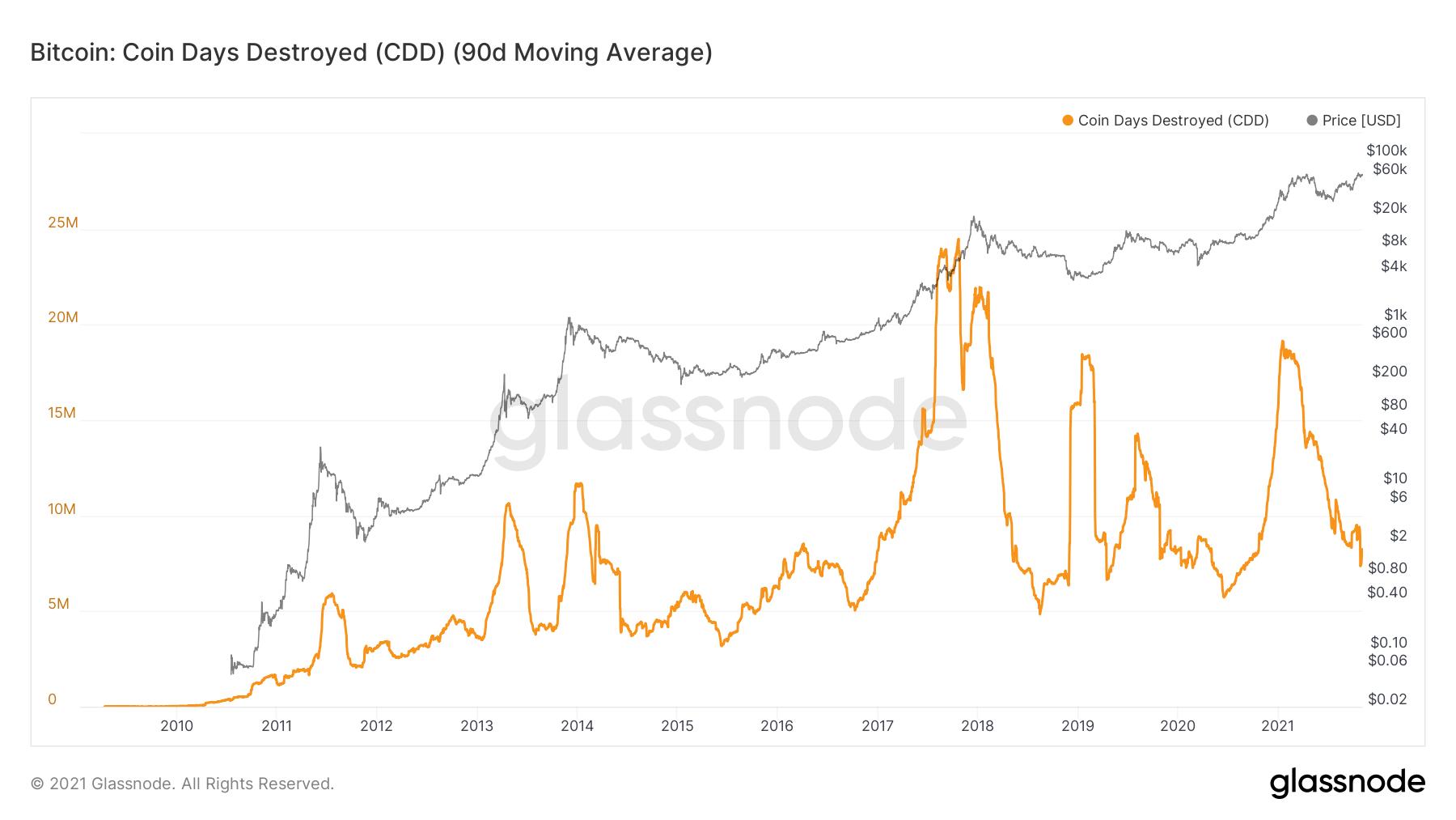
CDD chart – Source: Glassnode
CDD is a valuable tool for observing the behavior of long-term holders and smart money by taking into account both the lifespan and the volume of the tokens .
It is particularly suitable for observing macro-trends where entities that have accumulated in previous cycles begin to distribute.
- CDD < 5M : daily base traffic, provides a lower floor as the Bitcoin protocol accumulates DDs.
- CDD> 10 M : often correlated with bull markets (distribution) and highs or movements of old tokens.
- CDD > 15 M : uncommon high volatility events. Since 2017, indicator of capitulation or strong optimism.
Hashrate
The average number of hashes per second produced by miners on the Bitcoin network. Indicator of the state of security of the network, it is by this data that the difficulty of mining is adjusted.
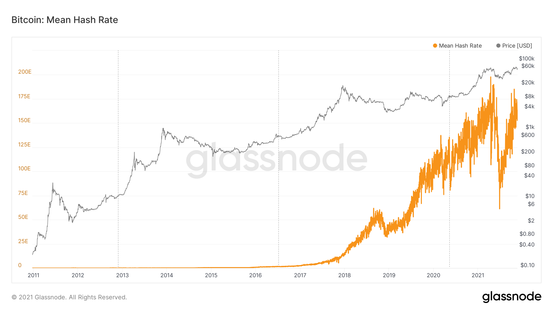
Hashrate chart – Source: Glassnode
Long Term Holders (LTH)
Categorized as long-term holders according to Glassnode, these entities retain possession of their tokens for periods ranging from several months to several years.
Glassnode’s heuristics estimate an approximate threshold of a 155-day holding period , after which dormant tokens become less and less likely to be spent.
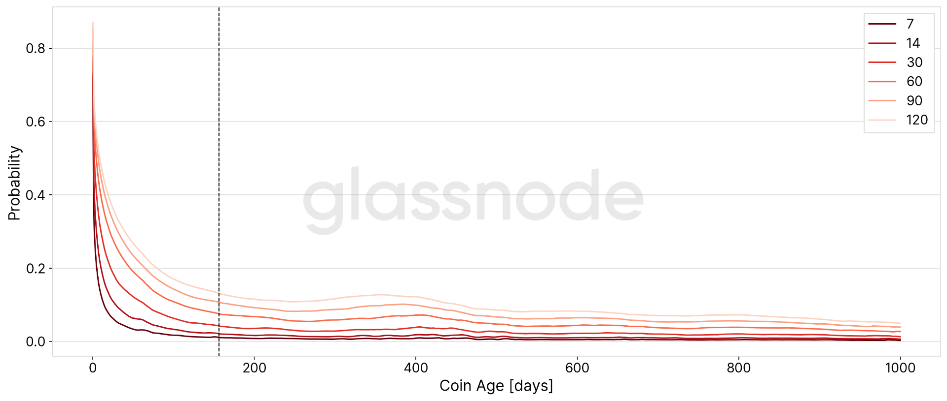
Graph of the probability that a UTXO will be spent according to the age of its token – Source: Glassnode
Difficulty (Mining)
The estimated number of hashes needed to mine a block . Symbol of network security, this parameter is recalculated every 2016 blocks (about 2 weeks) based on the hashrate.
Bitcoin’s difficulty is often referred to as the relative difficulty compared to the genesis block, which required around 2 ^ 32 hashes. For a better comparison with other blockchains, the values are shown in raw hashes .
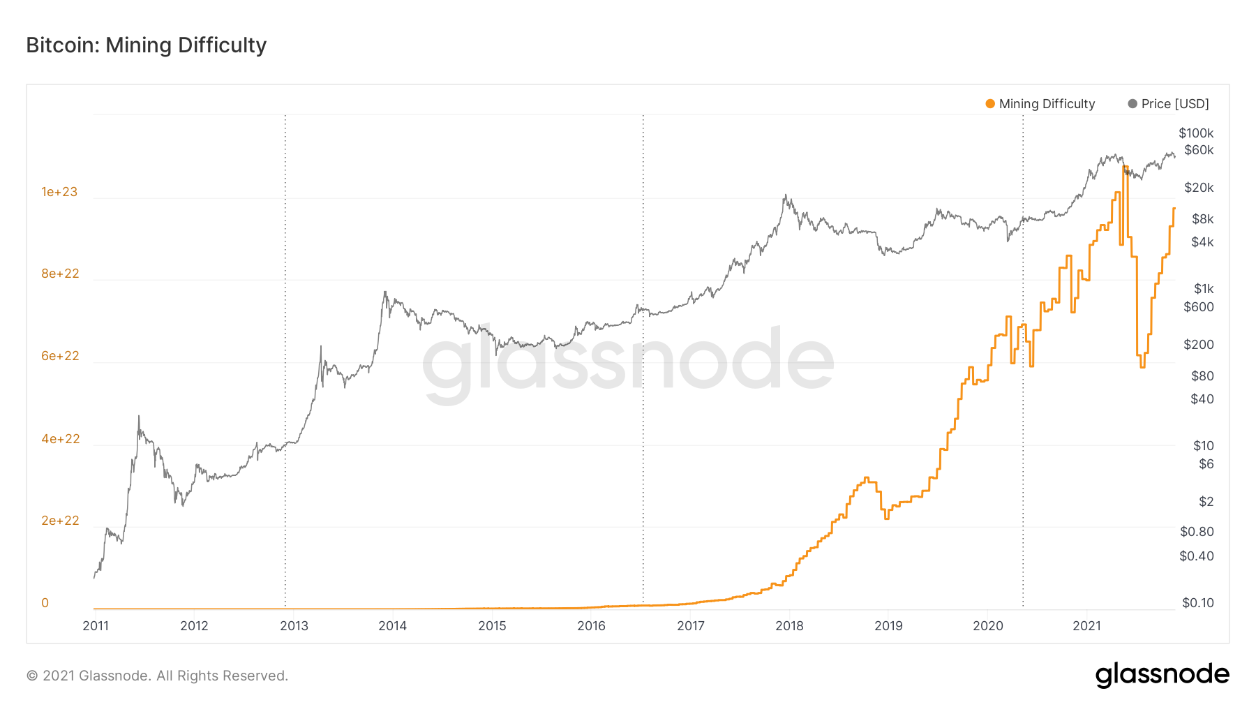
Mining Difficulty chart – Source: Glassnode
Liveliness
Liveliness provides insight into changes in HODLing behavior , helping to identify trends in the accumulation or distribution of long-term holders.
Each day, the network will accrue one JJ per UTxO. Simultaneously, some of these tokens will be spent and their DDs destroyed in transactions, resetting the lifetime of the moved tokens to zero.
The liveliness is calculated as the ratio between the accumulated DD destroyed and the accumulated sum of all DD ever accumulated by the network.
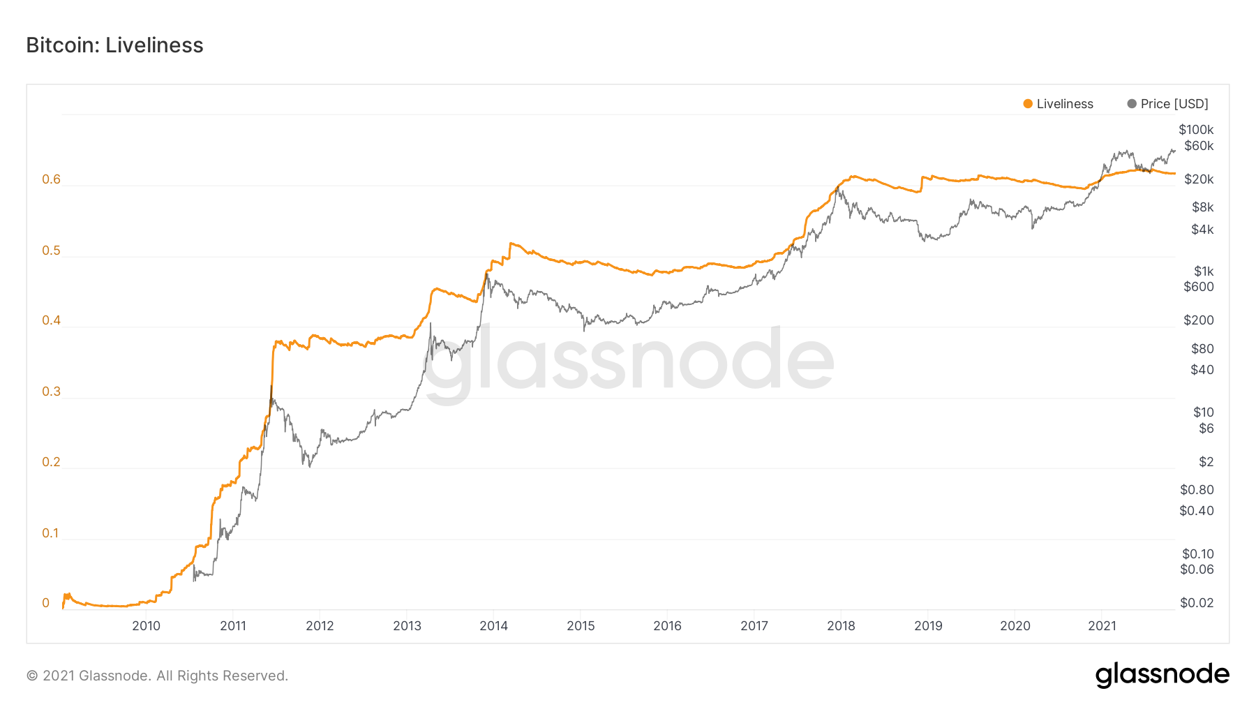
Liveliness graph – Source: Glassnode
It highlights periods when JJs are being destroyed at a faster rate than the global network is accumulating them.
- High values : On-chain activity , adoption , and network strain are high relative to the overall token lifetime.
- Low values : on-chain activity , adoption and use of the network are low.
- Increased liveliness : expansion of on-chain activity and/or dormant tokens with a long lifespan pumped back into the economy , thereby increasing liquid supply.
- Decreased alertness: reduced activity and/or tokens entering a state of dormancy and maturation, removing liquid supply from circulation.
Market Capitalization (mCap)
Traditionally , the market capitalization or market capitalization is a formula defining the total value of all the assets of a company . It is calculated by multiplying the price of a share by the total number of shares outstanding.
In the case of a cryptocurrency , this value is calculated by multiplying the price of a token by the total number of tokens in circulation.
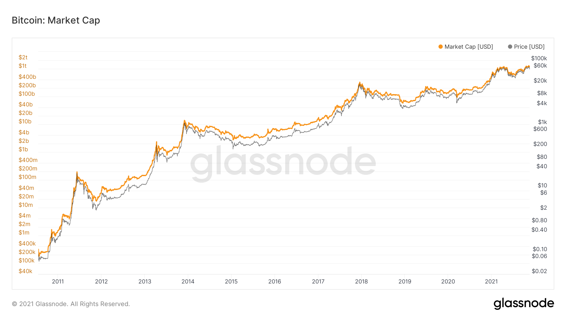
mCap chart – Source: Glassnode
MPRP Ratio
Following the same path as with the MVRV ratio, we obtain the MPRP (Market Price to Realized Price) ratio by dividing the spot market price (mPrice) by the realized price (rPrice) .
This ratio determines how far the spot price is from or near its cost base and helps determine whether the market is overvaluing or undervaluing the price of BTC .
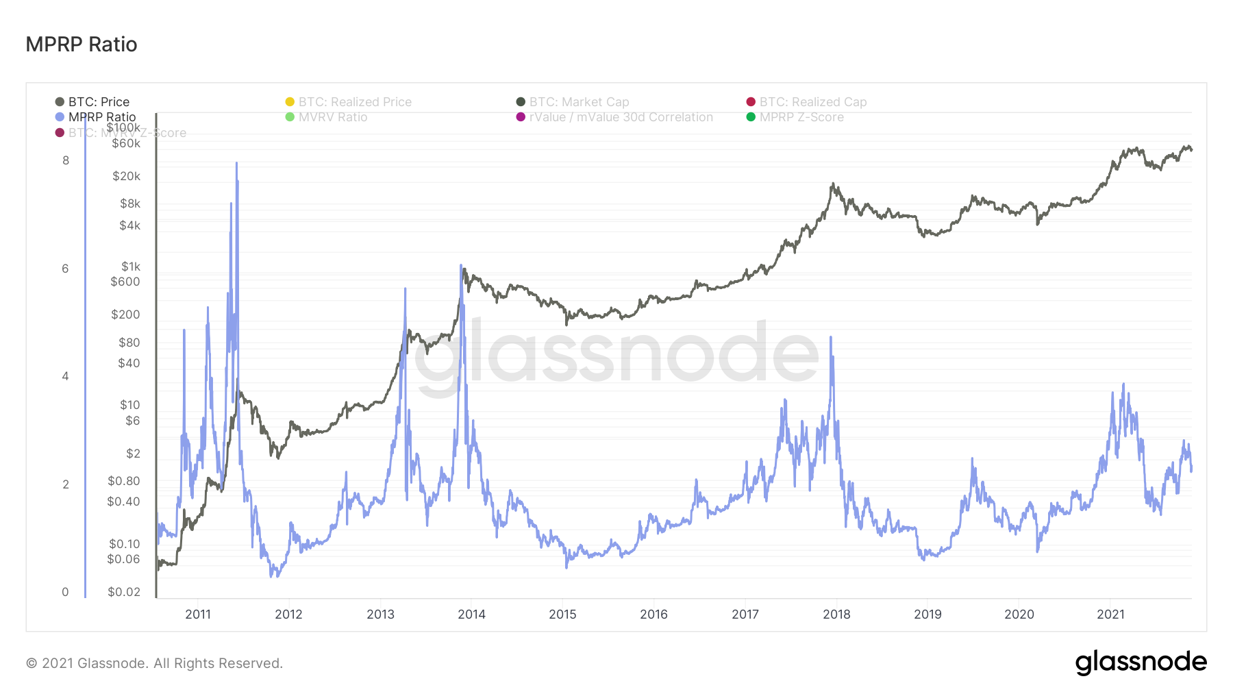
As for the MVRV Ratio, if the mPrice exceeds the rPrice ( MPRP > 1 ), the spot price is higher than the global base cost and the market will be in a general state of profit .
On the contrary, if the mPrice is worth less than the rPrice ( MVRV <1) , the market will be in a general state of loss .
Market Price to Realized Price Ratio (MPRP) chart – Source: Glassnode
MPRP Z-Score
The MPRP-Z Score is used to assess whether the price of an asset is overvalued or undervalued relative to its ” fair value “ , as evidenced by the spread between the spot price and the realized price.
Similar to the MVRV Z-Score, this indicator is defined as the ratio between the difference between the mPrice and the rPrice and the standard deviation of the mPrice.
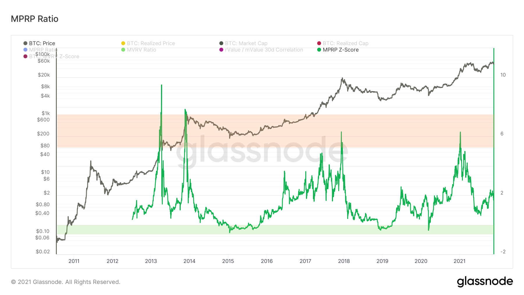
MPRP Z-Score chart – Source: Glassnode
When the market price is significantly higher than the realized price , this historically indicates a high (red area), while the reverse indicates a market trough/floor (green area).
MVRV Ratio
The MVRV ratio measures the deviation of the market capitalization from the realized capitalization of an asset. This is an oscillator that measures the overall profit or loss state of the market , indicating selling pressure and accumulation potential.
This metric is obtained by dividing the mCap by the rCap. By comparing these two metrics, the MVRV can be used to track when capitalization is above or below its “ floor / base value ” , helping identify market peaks and troughs.
 Chart")
Market Value to Realized Value Ratio (MVRV) chart – Source: Glassnode
Thus, if the mCap exceeds the realized capitalization ( MVRV > 1 ), the market will be in a general state of profit .
On the contrary, if the market capitalization is worth less than the realized capitalization ( MVRV < 1) , the market will be in a general state of loss .
MVRV Z-Score
The MVRV-Z Score is used to assess whether an asset’s capitalization is overvalued or undervalued relative to its ” fair value “ , as evidenced by the difference between its market value and its realized value.
Technically, this indicator is defined as the ratio between the difference between the mCap and the rCAp and the standard deviation of the mCap.

MVRV Z-Score chart – Source: Glassnode
When the market value is significantly higher than the realized value , this historically indicates a high (red area), while the reverse indicates a market trough/floor (green area).
Net Realized Profit/Loss (NRPL)
The Net Realized Profit/Loss indicator quantifies the gains/losses made by the market over a given period . It shows the net profit/loss of all tokens moved relative to the value when they were created.
NRPL is calculated by subtracting realized losses from realized profits.
As such, this metric indicates whether investors are selling at a profit or at a loss . It is very useful for measuring the extent of the damage following a strong distribution or for determining the state of portability of the market at an instant t.

Net Realized Profit/Loss NRPL chart – Source: Glassnode
The NRPL indicator reads as follows:
- NRPL > 0 : Overall, the market has made gains;
- NRPL < 0 : Overall, the market made losses;
- NRPL ≈ 0 : Overall, the market made neither losses nor gains;
- A break-even point serving as a support indicates that the market, in a state of profit, is struggling to make losses;
- A breakeven point serving as resistance indicates that the market, in a state of loss, is struggling to make gains .
Net Unrealized Profit / Loss (NUPL)
Alter ego of the NRPL, the Net Unrealized Profit/Loss indicator or unrealized net gains/losses, quantifies the gains/losses not realized by the market over a given period .
It helps answer the following question: “If all units of a given currency were sold today, how much would investors gain or lose”?
The NUPL is calculated as the difference between relative unrealized profits and relative unrealized losses.
This metric indicates whether investors are smoldering unrealized profits/gains . It is very useful for measuring the risk of selling pressure on an asset or for gaining insight into the bullish/bearish conviction of market participants.
Moreover, it makes it easy to determine a market sentiment depending on whether the bias at a time t is bullish or bearish.

Net Unrealized Profit/Loss (NUPL) chart – Source: Glassnode
The NRPL indicator can be interpreted as follows:
- NUPL < 0 : Market capitulation;
- NUPL > 0 : Hope (bull) – Fear (bear);
- NUPL > 0.25 : Optimism (bull) – Anxiety (bear);
- NUPL > 0.5 : Belief (bull) – Denial (bear);
- NUPL > 0.75 : Euphoria (bull) – Greed (bear).
Realized Capitalization (rCap)
Realized capitalization is a variant of mCap that better measures the value of distributed assets .
While mCap implicitly assumes that all tokens are active, the fact is that many BTC tokens are illiquid and dormant.
rCap filters out day-to-day market noise and helps to measure a more authentic value of the asset.
It is calculated by multiplying the price of the tokens at the time of the creation of the last UTxO by the total number of tokens in circulation.
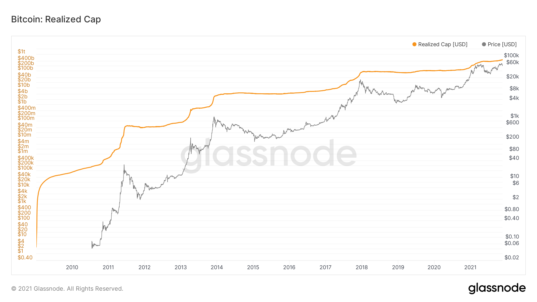
Realized Cap (rCap) chart – Source: Glassnode
Realized Price (rPrice)
Like rCap, rPrice is based on the latest price of UTXOs to provide an estimate of the base cost invested by all participants.
Obtained by dividing the rCap divided by the circulating supply , the realized price grows during up cycles as BTC tokens are sold for profit.
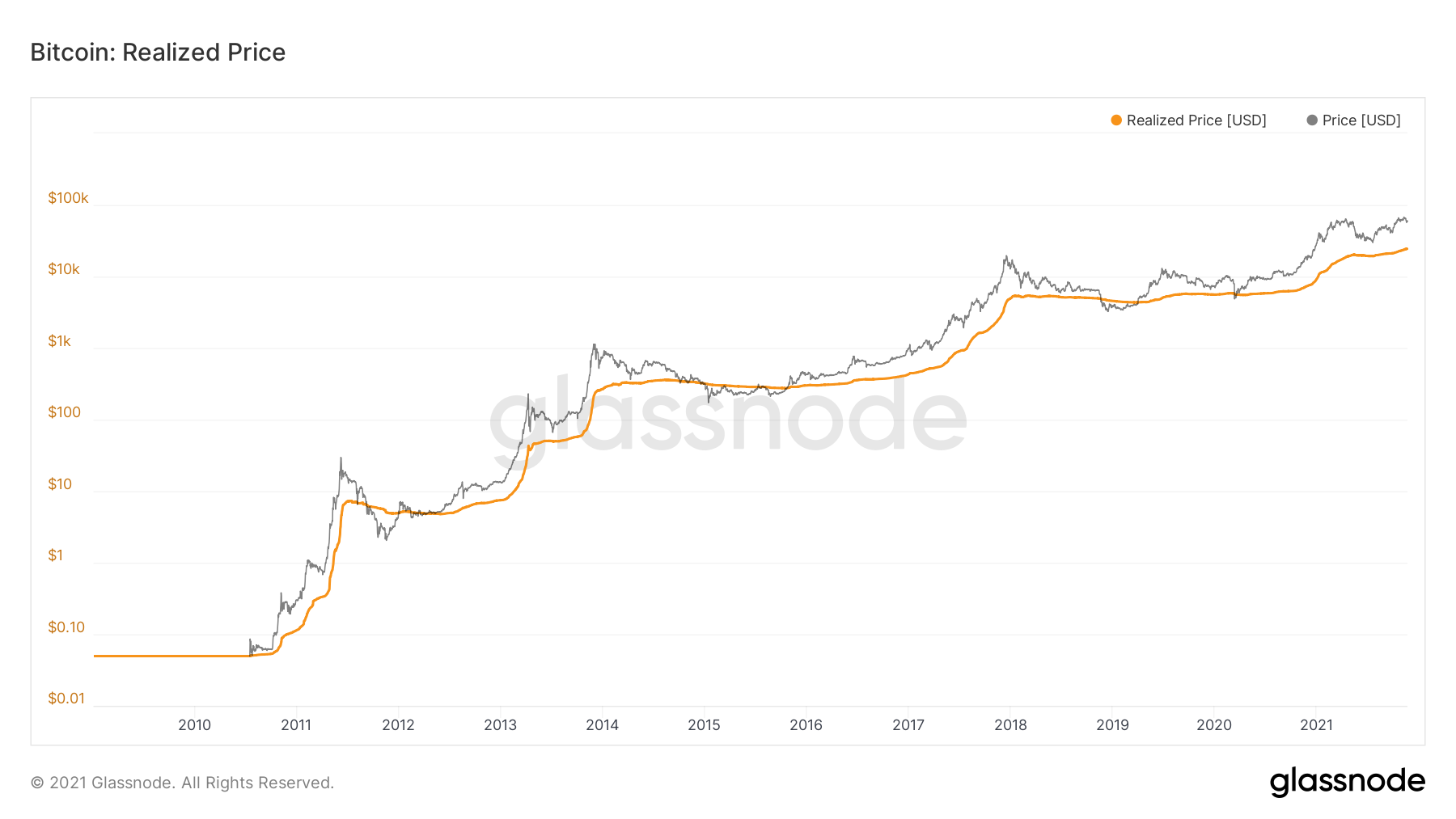
Realized Price (rPrice) chart – Source: Glassnode
Realized Volume Profile (RVP)
The volume profile is a well-known graphical study in traditional finance . It displays trading activity at specific price levels .
In the case of Bitcoin, the metric plots a histogram to reveal dominant and/or significant price levels based on realized volume .
So the volume profile takes the total realized volume traded at a certain price level during the specified time period and divides it by the total volume (buy or sell) and then makes this information easily visible as a cluster of columns.
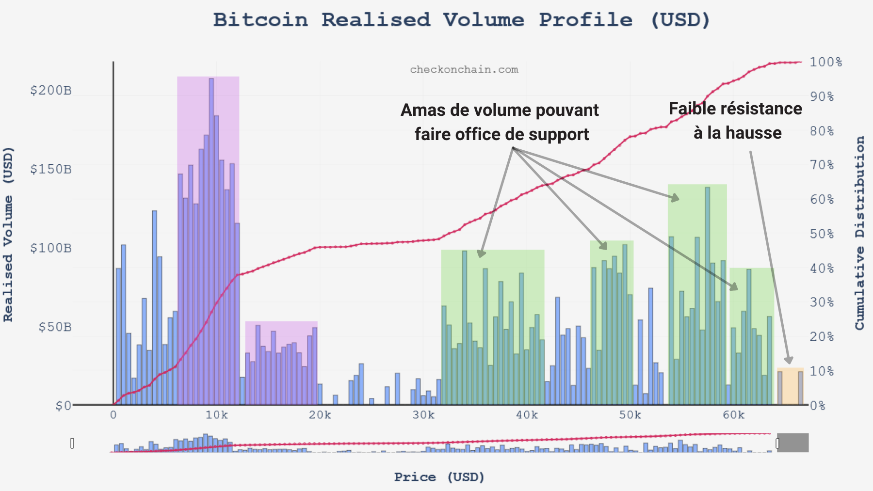
RVP chart – Source: checkonchain.com
Volume clusters/groupings often indicate resistance (above price) or support (below price) and indicate price levels that Bitcoin may be pulled towards in the event of a consolidation/range .
Spent Output Profit Ratio (SOPR)
The Spent Output Profit Ratio indicator offers an overview of the profits or losses made by all tokens moved on-chain .
The SOPR is calculated by dividing the realized value of a UTxO when it is destroyed by the value when it is created.
Visualizing the profit/loss made at all times, this indicator is often seen as a reflection of market sentiment. Both the absolute value of the indicator and the underlying trend give us an overview of the behavior of overall spending .

Spent Output Profit Ratio (SOPR) chart – Source: Glassnode
The SOPR indicator can be interpreted as follows:
- SOPR > 1 : Moved tokens sell, on average, at a profit (buy price > sell price);
- SOPR < 1 : The tokens moved sell, on average, at a loss (purchase price < sale price);
- SOPR ≈ 1 : Displaced tokens sell, on average, close to break-even (buy price ≈ sell price);
- An ascending SOPR implies that profits are made as previously illiquid supply is potentially recirculated;
- A descending SOPR implies that losses are realized and/or profitable tokens are not spent.
Spent Output Age Bands (SOAB)
The Spent Outputs Age Bands metric groups spent tokens into different degrees by age and represents them with colored bands as a proportion of total tokens moved.
This metric is calculated by targeting the age of tokens that have been transacted (destruction and creation of a UTxO) within the specified time window.
Useful for observing the age of tokens in motion, it helps to determine whether the market is influenced by long-term or short-term players and even to identify token distribution and maturation cycles.

Spent Output Age Bands (SOAB) chart – Source: Glassnode
Concretely, warm colors (yellow) will dominate on days when more young tokens are spent while cool colors (purple) will occupy a large part of the bands on days when old tokens are spent.
Barring capitulation or strong distribution, the majority of tokens traded daily are less than a month old.
Spent Volume Age Bands (SVAB)
A cousin of SOAB, it is in the form of volume that this indicator depicts the age of UTxOs. Spent Volume Age Bands (SVAB) are a separation of on-chain transfer volume based on token age .
This metric presents the proportion of BTC volume classified into different age bands.
Useful for observing the age of moving tokens, it helps to determine whether the transfer volume is dominated by long-term or short-term players .

Spent Volume Age Bands (SVAB) chart – Source: Glassnode
As with SOAB, warm colors (yellow) will dominate on days when a large volume of young chips will be spent while cool colors (purple) will occupy a large part of the bands on days when the volume of old chips is dominant.
Short Term Holders (STH)
Categorized as short-term holders according to Glassnode, these entities include market newcomers, active traders and “weak hands” in that they are more likely to exit their positions in response to market volatility. .
Tokens less than 155 days old are statistically more likely to be re-spent , and are therefore considered a more liquid and active part of the circulating supply.
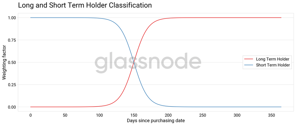
Classification of entities according to the duration of token holding – Source: Glassnode
Unspent Transaction Output (UTxO)
This term refers to the output of a transaction that has not been used as input in a new transaction .
UTxOs can be compared to physical coins, in that they must be spent discreetly. If you want to spend a 5 cent coin, you can’t spend half of a 10 cent coin. You must spend the entire coin and receive a 5 cent coin as change.
Unlike physical coins, UTxOs do not have standardized denominations . A UTxO can hold any amount of BTC.

Simplified diagram of a Bitcoin transaction